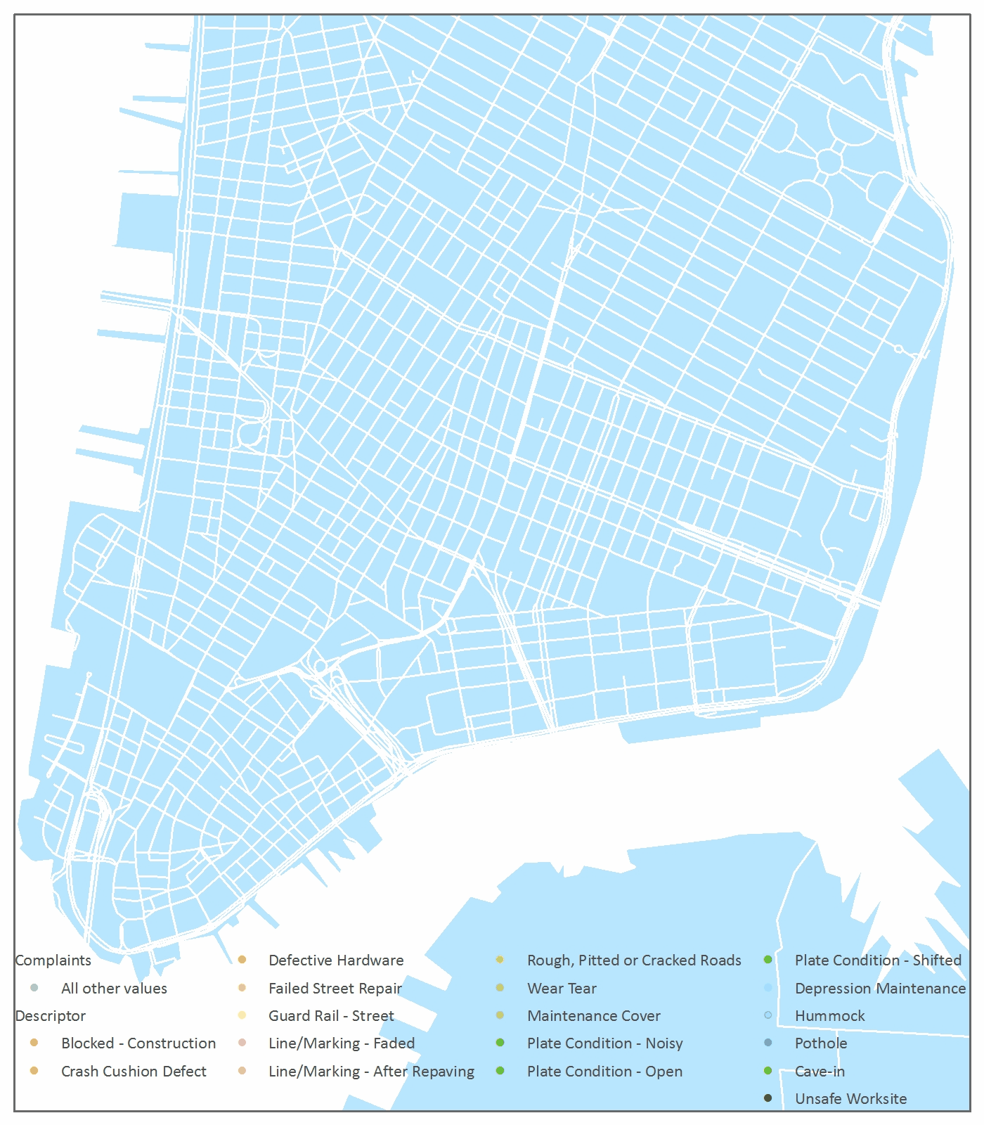
Mapping The Damage Done to Manhattan Streets in a Year
NYC DOT collects 311 complaints about roads. I animated the damage done over 2012 to visualize the beating that Manhattan streets take. It's no surprise that potholes are the biggest complaint, with practically one or more on every block. There is a scary number of "unsafe worksite" and "cave-in" (gah!?) reports.
This was a good project to experiment with the relative advantages of using a time slider to export to a movie versus building a GIF. The time slider works well but is fickle, and I find the enable time feature to be limiting. Some other features aren't as adaptable as I'd like them to be - for example, displaying the legend and identifying the best time increments. On the other hand, building the GIF is tedious. My computer is so slow with video that making GIFs was somehow faster.
What I had really hoped to do with this data was to visualize complaints as they happen throughout the year, and then have the points disappear as the complaints are addressed. This might give insight into which complaints and neighborhoods get the most and least attention. It became clear as I built the animation this way that the DOT system for reporting a complaint as "closed" is pretty arbitrary. The "closed" dates for each report were always close in time to some cluster of complaints, and stretched precisely a month apart, looking suspiciously like any given pile of complaints that might have accumulated on a desk over a month were all closed out before some analyst deadline.
All Upper Manhattan reported street complaints in 2012 every 19 days. All Lower Manhattan reported street complaints in 2012 every 19 days. Data from NYC Open Data 2012 311 complaints to the Department of Transportation.