Mapping Rent Control In Jersey City Part 1

Jersey City is one of the most expensive cities in the country for renters. On paper, it has a strong rent control regime: any building with 5+ units is rent controlled unless it fits into one of three narrow exemptions. But in practice, most tenants don’t know whether their building is rent controlled, and rent control is seldom enforced. For tenants, figuring out whether their building is rent controlled can be extremely time and labor intensive. This post documents preliminary steps towards a comprehensive, city-wide audit to determine which buildings are legally rent controlled.


State & Local Rent Control Rules

In 1987, New Jersey authorized its municipalities to pass their own rent control ordinances in the Newly Constructed Multiple Dwellings Law (NCMD). N.J.S.A. 2A:42-84.1, et seq. However, in passing NCMD, the state legislature determined it “necessary for the public welfare to increase the supply of newly constructed rental housing.” N.J.S.A. 2A:42-84.5(b). To avoid deterring new construction, the legislature elected to “exempt new construction of rental []units from municipal rent control.” Id. Accordingly, the NCMD states that any residential properties constructed after June 25, 1987 may be exempt from municipal rent control for either (a) 30 years from the completion of construction, or (b) the period of amortization of any initial mortgage loan, whichever is less. N.J.S.A. 2A:42-84.2(a)-(b). To be exempt, a new building must file “a written statement of the owner's claim of exemption” with the municipal construction official at least 30 days prior to the issuance of a certificate of occupancy. N.J.S.A. 2A:42-84.4. New Jersey courts have affirmed the NCMD requirements. See Willow Ridge Apartments, LLC v. Union City Rent Stabilization Bd., No. A-3578-20 (N.J. Super. App. Div. 2022) (holding newly constructed apartment building was subject to rent control because property owner could not prove compliant filing with construction official).

Following NCMD, Jersey City elected to pass an ordinance establishing local rent control for residential buildings. Jersey City Mun. Ord. § 260 et seq. Rent controlled buildings can only increase rent by 4% or the change in CPI, and any rent increase “in excess of that” is void. Id. § 260-2(D), 3(A). As it must, Section 260 incorporates the exemption process from NCMD, for buildings constructed post-1987 that timely file a notice of exemption. Id. § 260-6(C). And Section 260 further exempts buildings from rent control where: (1) it has four or fewer units, (2) it is newly-constructed with 25+ units and located within a council-approved redevelopment area, or (3) it is a low rent public housing development. Id. § 260-1(A)(1)-(4).

Taking NCMD and Section 260 together, rent control applies to all five+ unit residential buildings in Jersey City, unless the building:

  • was constructed after 1987 and timely filed a compliant exemption; or

  • is new 25+ unit development that is located in a redevelopment area; or

  • is a low rent public housing development.


Mapping Rent Control

Given the legal framework, to map buildings subject to rent control, we need the following information:

  • Shapefiles for buildings and parcels;

  • Whether each building filed an exemption filing ([filing]);

  • The year each building was constructed ([year]);

  • The number of units for each building ([units]);

  • Whether the building is located in a redevelopment area ([redev]) and, if so, what year the area was council-approved ([redev-year]); and

  • Whether the building is a low rent public housing development ([JCHA]).

Once I have all of the above information, I can tag buildings as rent controlled by default where: [units] > 4. Then, I can tag buildings as exempt where: ([year] > 1987 AND [exemption filing] = true) OR [JCHA] = true OR ([redev] = true AND [year] >= [redev-year] AND [units] > 25).

I started by downloading the shapes of New Jersey municipalities from the NJ Geographic Information Network and extracting the polygon for Jersey City—not strictly necessary, but might be nice to have for the final maps. Then I got into it:

Step 1: Map Parcels

First, I downloaded parcel shapes data from JC Open Data and mapped them (below). Unfortunately, that dataset appears to have last been updated in 2018—not great.

To get more recent parcel shapes, I checked the county GIS site, which does have parcel shapes updated as of August 2025—but it doesn’t have easily downloadable shapefiles. To get this data in editable form, I found the GIS REST service URL for the Hudson County parcels layer in the metadata. Then, I used the QGIS “Add ArcGIS Feature Server Layer” feature to connect this service layer and visualize it. In an ideal world, I would have just been able to select all parcels within Jersey City and export this selection directly as a local shapefile. However, This REST layer had a max record count of 2000 for queries. So I used a python script to autoquery records in sets of 2000 and export a shapefile, which I then added as a layer. I then edited the layer to delete all features in the county except those in Jersey City. I would give you an image of that, but it looks is exactly the same as the 2018 data.

After all that, I bulk downloaded current assessment data for Jersey City from the county Assessment Records Search tool in a spreadsheet, and merged that data onto the parcel shapes by block, lot, and qual. Unlike the parcel shapes data, the assessor data has important variables like addresses, owner information, assessment information, and critically, building age and property class information (a proxy for number of units)—these variables will become important below. A whole lot of work for a pretty boring map to start:


Step 2: Map Buildings

Next, I imported OSM buildings data by using the QuickOSM plugin. I plan to use this data to identify shapes for buildings that are associated with exemption filings. This isn’t strictly necessary—I could do everything by parcels, which contain basically all of my variables of interest. But 1) I am an aesthete and buildings are prettier; 2) I worked hard to make this data way back read—read about here; and 3) at the end of the day, tenants are going to intuitively think about whether their building is rent controlled, not the parcel it’s on.


Step 3: Request Rent Control Exemption Filings and Map Them

This step is the doozy. In late 2022, I submitted an Open Public Records Act (OPRA) requesting every single rent control exemption filing in the city starting in 1987. You can see that request here. In addition to exemption filings, I requested related documents and communications. Over several months, after repeatedly clarifying that I sought all such records, I received responsive documents. In total, there were only responsive records associated with 128 properties. I saved those files in a Google Drive folder and prepared a spreadsheet summarizing the filings. These properties are not automatically exempt from rent control; with a cursory review, it’s clear that many of these properties do not have compliant filings. But regardless, for tenants wondering whether their building with 5+ units might be exempt from rent control, this list is a solid starting place. Note that I submitted an updated OPRA request in summer 2025 to identify any filings post-dating 2022, and that request is in progress. With my spreadsheet, I reverse-geocoded the addresses for these properties. Then I imported lat/long information into QGIS to create a point layer of exemption filings.

Then, I wanted to identify the specific building footprints associated with these addresses, so I did a spatial join. To my surprise, based on a manual check, this correctly identified buildings in about 60% of cases. The other 40% required manually looking up the address at issue, and then consulting google maps, satellite imagery, and the block/lot number in parcel data. In a few instances, the OSM buildings data wasn’t up to date, so I edited the OSM dataset before merging on the exemption filing information. After that, I can toggle off the points layer and map buildings with extant rent control exemption filings. See below right image.


Step 4: Map Building Years

Next, I focus on the building year information in the assessment data. I need accurate information about building construction years in order to (1) identify exempt new construction within redevelopment areas, and (2) confirm that all exemption filings were filed in connection with buildings constructed after June 25, 1987, per the NCMD. Regarding (1), the NCMD and Section 260 do not define “newly-constructed” for purposes of identifying exempt buildings in redevelopment areas, but I think the best reading of that provision is that buildings are exempt when they were constructed after the redevelopment plan in question was approved by the council. Regarding (2), the county assessor only keeps information on building construction years, not months/days, so the best I can do is tag buildings constructed after 1987 as post-1987 (1988+ below), which may introduce some errors if exemptions were filed before the end of 1987, but there shouldn’t be too many of those cases to investigate.

The building years information needs some clean up. The data identifies buildings constructed between 1720 and 2025, which makes sense. However, there are about 1300 parcels with nonsense year information, i.e., values like “0800,” or unintelligible information, i.e., values like “0000,” “0001,” “0005,” “0021,” etc., which could either be nonsense, or could indicate buildings constructed in ‘00, ‘01, ‘05, ‘21, etc. Unfortunately nothing in the state user manual for tax data helps me figure out how to treat the unintelligible values. In an abundance of caution, I treat building year info in all of these cases as null. Where rent control status hinges on the year for these buildings, we’ll need to manually investigation them.

Beyond these 1300 instances, there are a large number of parcels (9.9 thousand out of 59.5 thousand) where the building year is unknown/already null. This isn’t ideal, but until we load up redevelopment area data, we won’t have a sense of how many 25+ units in these areas are missing year information.

One weird thing I notice right away is that some buildings with exemption filings appear to have been constructed before 1987, which doesn’t make a lot of sense (unless the building filed an exemption well after construction was completed, in hopes of pulling a fast one on the city/tenants—possible). These are not cases where the building was constructed within 1987 and miscoded. I’ll investigate these instances once the rest of the audit is up and running.


Step 5: Map Building Units

In an ideal world, I would have comprehensive data about the number of units per building. This field isn’t standard in OSM or the county parcel/assessor information. However, assessor information does include a field called property class, which is a standardized field to indicate types of uses. According to the state user manual, for the classification of taxable real property, the following codes are applicable:

  • 6A Personal Property Telephone

  • 6B Machinery, Apparatus or Equipment of Petroleum Refineries

  • 15A Public School Property

  • 15B Other School Property

  • 15C Public Property

  • 15D Church and Charitable Property

  • 15E Cemeteries and Graveyards

  • 15F Other Exempt properties not included in the above classifications

  • 1 Vacant Land

  • 2 Residential (four families or less)

  • 3A Farm (Regular)

  • 3B Farm (Qualified)

  • 4A Commercial

  • 4B Industrial

  • 4C Apartment

  • 5A Class I Railroad Property

  • 5B Class II Railroad Property

It is not 100% clear to me whether residential buildings with four families or less is equivalent to residential buildings with four units or fewer, but in any event, this is the best proxy we’re going to get. So I used the parcel/assessor to map all buildings with property class 4C (below). Note that I have stopped symbolizing building years because that would be way too much to take in at once.

On the one hand, this looked generally right to me. But on the other, there are some properties with exemption filings, which I know to be residential apartments, which appear to have non-4C class codes. For example, 120 Clifton Place is The Beacon—a mixed use building with dozens of residential units. But its current property class is 1, for vacant properties. See the building selected in yellow below. This is true even in the most up to date assessor information through the county portal. Just another thing to investigate when we get everything up and running.

Lastly, while the 4C code identifies 5+ unit residential buildings, that’s only half the battle; we still need to identify 25+ unit residential buildings located within redevelopment plan areas. But let’s put a pin in that for now.


Step 6: Map Redevelopment Plan Areas

Next, I will need shapefiles for redevelopment areas, to identify every new building in one with 25+ units. Apparently there are 104 areas, according to the latest zoning map. Unfortunately, the underlying shapefiles are not available through the open data portal—there is one quite old file geodatabase on there but it is corrupted. But there is a web ArcGIS viewer with zoning and redevelopment plan information. Like I did to get parcel data from the county, I looked at the layer metadata, found the GIS REST service URL, and used the “Add ArcGIS Feature Server Layer” feature to connect this service layer and visualize it. Fortunately this file had fewer than 2000 objects, so I didn’t need to use a script to perform multiple queries. Once I loaded up the zoning information, there was a simple field called "redev area" which I used to query shapes of the 104 redevelopment plans and map them (turning off the building layer to keep things from getting too crazy):

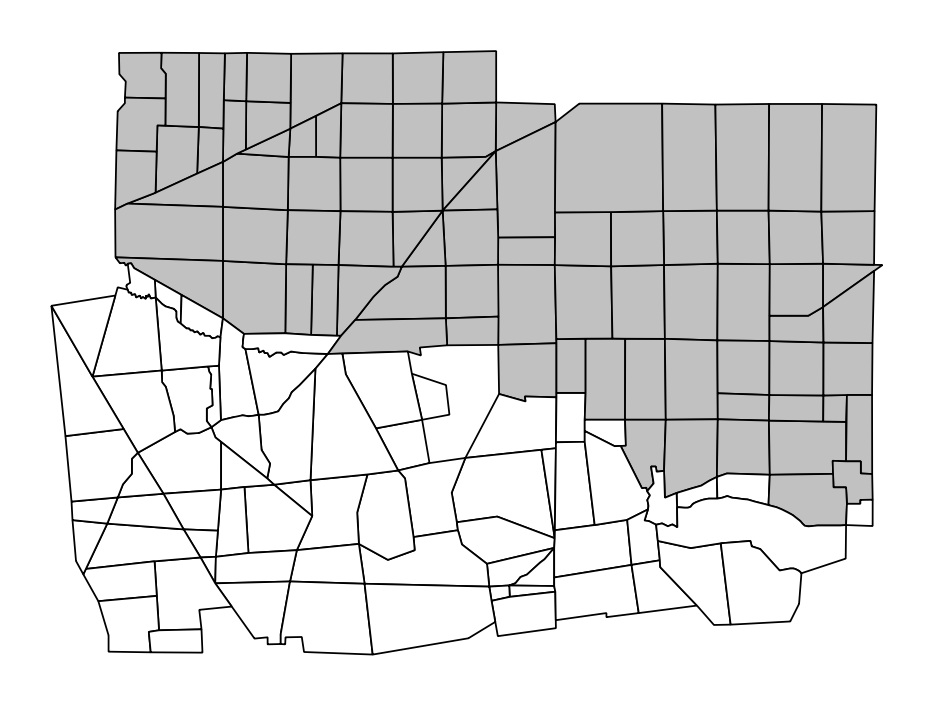
This is the part where it got messy. I attempted to use a spatial join to automatically capture parcels that fall within redevelopment areas, but I hit two snags. First, the parcel data and redevelopment plan data aren't perfectly, precisely drawn, so capturing parcels exclusively within plan areas is very underinclusive of parcels of interest, and capturing parcels within or intersecting plan areas is highly overinclusive. Second, I kept getting errors for “invalid/complex geometries” in the parcel data because there are all sorts of geometry issues like non-connecting boundaries and vortexes. Given then, I selected by location to find parcels in each plan area, did an exhaustive manual data check, and eventually tagged those parcels with their plan area name. Then I merge plan area information onto those parcels tagged within a plan area. Conveniently, for each redevelopment plan, there is an "ADPT_DATE" field that indicates the date the plan was first adopted. Now I can map parcels within redevelopment plan areas:

Finally, I can map this information and display (1) parcels within a redevelopment area and (2) the subset of those parcels that were constructed after the plan adoption date, i.e., that might be exempt. Where parcels are missing building year information, I treat it as being in the former category. Unfortunately, I still don’t have information on the number of units per building to identify those with 25+, which are the ones that should actually be exempt, so I’ll need to manually investigate those at the end.


Step 7: Map Public Housing Developments

Lastly, I will need to map low rent public housing developments. To start, I made a table of public housing developments, by referencing the Jersey City Housing Authority website. Then I used the block/lot information to merge that table onto parcels, and symbolize parcels by public housing status:


Next & Final Steps

With all that done, the data is nearly prepped. The few last pieces to run down are: (1) an OPRA response to confirm there are no new filings post 2022; and (2) how to identify 25+ unit residential buildings within the redevelopment plan areas (or buckle down and go through them manually). And then it’s time to get this up and searchable.

Making (More) Maps for the Yale Law Journal: Protecting Student Voting Rights in Texas

During my time as the Empirical Scholarship Editor for the Yale Law Journal (YLJ), I got to work with a number of talented authors and amazing student editors. Every once in a blue moon I was able to collaborate with an author and make maps to accompany their piece. One of those instances was for a Volume 129 Forum piece by Joaquin Gonzalez, titled Fighting Back to Protect Student Voting Rights.

Gonzalez spent a year at the Texas Civil Rights Project on a YLJ-sponsored public interest fellowship, during which he worked on election and voting-rights issues. During that time, he observed how student voters “face a wide variety of obstacles that can deter them from democratic participation.” For example, many jurisdictions do not accept student identification as ID for voting purposes. In other jurisdictions, voting locations on or near colleges and universities are sparse. Gonzalez writes that, “[t]his lack of access can be the direct result of actions by governing bodies (such as removing or failing to provide on-campus polling locations) or the indirect result of combinations of policies (such as a combination of purposeful campus gerrymandering and strict rules regulating which precincts residents must vote in).” In order to illustrate some of the consequences of “direct” and “indirect” limitations on student voting locations, Gonzalez hoped to generate a few maps of egregious examples. We worked together before publication to produce two figures to accompany his essay.

Figure 1 (below) represents the current election precinct boundaries in Hays County, Texas. Gonzalez chose to highlight precincts that contain Texas State University (TSU), a large public university in Hays County, because “TSU is home to 38,661 students, over 7,000 of whom live on campus, with thousands more living in private housing in the immediate vicinity.” Gonzalez writes:

The lines are winding, though at first glance they may not look inherently illogical. However, overlaying features of the campus reveals the distorted way in which the community is carved into different precincts. Some of what appear to be streets on the precinct map are in fact merely paper streets or walking paths. Perhaps the most absurd result is that the Student Center, which has housed the only on-campus voting location ever used, is bisected by the precinct lines.

 
image005.png
 

Figure 2 shows where many of the major on-campus residences are located—a confusing distribution between precincts by any measure, with no clear or logical dividing lines for which residential halls are assigned to which precinct. Figure 2 also shows Hays County’s proposal for the intended placement of its Election Day poll sites prior to our threatening litigation. State law permits combining precincts into one polling place under certain circumstances. The county originally intended to combine each of the two primarily on-campus precincts with two off-campus precincts, meaning that students in those precincts would have to travel off-campus (approximately 2.2 miles in one case and 1.7 miles in the other) to cast their ballot. On top of figuring out the complicated and illogical assignment of residence halls to different precincts, students (many of whom lack transportation) would have had to find a way to get to these polling locations. One of the polling locations is separated from campus by a highway. If a student showed up at the wrong location, she would have to travel 3.4 miles in the opposite direction to reach the correct location.

 
image006.png
 

I made these maps in QGIS and used Stamen toner basemaps. You can read Gonzalez’ full piece here.

COVID-19 Hospital Capacity and Incarcerated Populations: Making Maps for ACLU Wisconsin

This April, I worked with a number of litigators and public health experts to collect, map, and analyze data about how COVID-19 poses a unique risk to incarcerated populations, in support of several lawsuits seeking prisoner release amid pandemic. This entailed collecting data about prisons and jails, incarcerated individuals, real time hospital capacity and ICU bed capacity, and more. We partnered with the ACLU in Wisconsin, where prisons and jails are overcrowded far beyond their design capacity, and ultimately produced a series of maps that were used in a lawsuit filed directly in the Wisconsin Supreme Court seeking the release of certain vulnerable people from state prisons. You can read the complaint and see the exhibits here.

We knew from public health research that an outbreak in a prison or a jail would have enormous consequences for incarcerated populations and staff because social distancing in those facilities is nearly impossible and inmates regularly share space and resources. Given that, infection spreads faster in jails and prisons than other communities. When more individuals get sick around the same time, hospital resources are strained, especially where there are few staffed beds and ICU beds in the first place. We set about trying to identify places in the state where an outbreak in a prison would be likely to overwhelm hospital resources and result in a large number of deaths, for the individuals who would not be able to get the healthcare they need like a ventilator or an ICU bed.

We presented some of our early research in an online townhall on COVID-19 in prisons and jails hosted by the Wisconsin ACLU, which you can watch here. Here are some notes and maps from that presentation:

We started with a goal that seemed simple: identify specific places in Wisconsin that have (1) large correctional communities, and (2) a dearth of hospital resources. First, we were able to get information on correctional populations from the Wisconsin Department of Corrections, including the number of inmates and staff per facility. That data did not include any information about jail detainees or staff (that data is owned by each county), or family members of any prison or jail staff, and all of those people are part of the larger population who would be vulnerable if there was an outbreak in a facility, so we knew our preliminary population numbers were under-inclusive, but it was a start.

From there we went about collecting information on hospital resources. That was really not an easy task because, as a general rule, hospital data can be really messy. When we started this effort, in March we had just two available sources of information about hospital capacity: The Wisconsin Hospital Association and the American Hospital Directory. There were a number of issues with the data: (1) it was from 2018, so it did not reflect real time hospital occupancy and availability, and (2) there were discrepancies between the two data sources. We struggled to identify and resolve discrepancies in the data, but ultimately just we did the best we would and we were able to extract indicators like total staffed beds and ICU beds per hospital, and average occupancy rates, we which used to then estimate the number of available beds at a given moment (but again, not reflecting COVID-19 reality).

With that we made this preliminary map (below), which was actually very useful at first because it gave us a sense of geographic areas we should be worried about. The shapes of counties are colored according to the number of people per available hospital bed. That is, total county population divided by our estimated number of available beds. Initially this might seem like a counterintuitive visualization because we’re used to looking at maps that show a certain phenomenon per capita, rather than the other way around (capita per phenomenon), but this style of map is useful in the public health context because it allows you to compare real numbers of potentially sick people to real numbers of available resources. Another way to describe this visualization scheme is that each county’s color shows how many people would be competing for a single hospital bed, if everyone were sick at once. Counties shown in darker red have a higher number of people competing and, therefore, are relatively more resource-constrained. Areas on the map that have both a darker red colors and large correctional communities are especially concerning. So, this preliminary map was helpful in that it drew our attention towards central and eastern regions of the state, which have a lot of prisons and relatively few hospital resources.

 
4.8-available-ICU-beds.jpg
 

Fortunately, since we started our mapping efforts, the Wisconsin Hospital Association released a new tool with daily updates on bed counts and number of COVID-19 cases, so we could pull that information daily and compare it to what we knew about correctional populations. That daily information is provided at the healthcare emergency readiness coalition region (HERC) level. HERCs are regions within which certain healthcare and emergency response services are coordinated.

So with this information, we were able to look into HERCs that have large correctional populations and get a sense of where, if there was an outbreak, we would really be in trouble because of the scarcity of hospital resources (in particular, available ICU beds). So we went HERC by HERC and reported a few key indicators: the total population, the total correctional population, real hospital and ICU bed availability, and real numbers of COVID-19 cases and ICU COVID-19 cases.

 
Picture1.png
 

Take for example, Fox Valley, in the central/eastern part in the state. That area has over half a million people, and 4500 people in its correctional population. As of the day we gave the ACLU zoom presentation, there were just 34 available ICU beds in the entire HERC. So, we did the following back-of-the envelope calculation: if even just half of the Fox Valley correctional population was infected in an outbreak, and assuming 10% of that group would need to be put on a ventilator (an extremely conservative estimate according to average hospitalization trajectories), that would mean we would need 225 beds. That’s a pretty fast-and-loose calculation because it assumes instantaneous infection, when in reality individuals would be infected over a series of weeks, and hospital beds would surely turn over as patients were released or died, but it nonetheless highlights the enormous mismatch because the vulnerable population and the number of likely available hospital resources, within the region in which individuals would be likely to receive treatment.

So the takeaway of this visual analysis was that (1) we should be really worried about these areas that have tons of prisons in the central/eastern part of the state, and (2) areas that we otherwise might not be so worried about because they are less populated, like the northernmost HERCS, actually could really be a problem. For example, Northwest HERC does not have a big population, relative to other parts of the state, but it does have a pretty sizable correctional population and very few ICU beds, so it could be hit especially hard if there was a prison outbreak.

Unfortunately, in the particular lawsuit that I mentioned at the beginning of this post, the Wisconsin Supreme Court declined to take the case (the petition asked the court to take original jurisdiction over the case, and thereby pass the lower courts). The court stated that is was “not persuaded that the relief requested, namely this court’s appointment of a special master to order and oversee the expedited reduction of a substantial population of Wisconsin’s correctional facilities is, in view of the myriad factual determinations this relief would entail, either within the scope of this court’s powers of mandamus or proper for an original action.” The Wisconsin ACLU has continued to advocate for the protection of its incarcerated populations in a number of other ways amid pandemic.

The team that I worked with on these Wisconsin projects has also been pursuing a similar COVID-19 mapping effort in New York. The map below (displaying the same phenomena that we initially mapped in Wisconsin) was prepared for leadership of the New York Department of Corrections and Community Supervision, as part of advocacy to the Governor to use his emergency powers to temporarily amend medical parole criteria to enable the release of certain inmates.

1c-pop-per-all-available-beds.jpg

Making Maps for Yale Law Journal

I recently had the pleasure of making a few fun maps for Professor Maureen E. Brady’s new article in the Yale Law Journal: The Forgotten History of Metes and Bounds. You can read the full thing as featured in Volume 128, Issue 4, here. Brady describes the piece as follows:

Since long before the settling of the American colonies, property boundaries were described by the “metes and bounds” method, a system of demarcation dependent on localized knowledge of movable stones, impermanent trees, and transient neighbors. Metes and bounds systems have long been the subject of ridicule among scholars, and a recent wave of law-and-economics scholarship has argued that land boundaries must be easily standardized to facilitate market transactions and yield economic development. However, historians have not yet explored the social and legal context surrounding earlier metes and bounds systems—obscuring the important role that nonstandardized property can play in stimulating growth . . . Using new archival research from the American colonial period, this Article reconstructs the forgotten history of metes and bounds within recording practice. Importantly, the benefits of metes and bounds were greater, and the associated costs lower, than an ahistorical examination of these records would indicate. The rich descriptions of the metes and bounds of colonial properties were customized to the preferences of American settlers and could be tailored to different types of property interests, permitting simple compliance with recording laws. While standardization is critical for enabling property to be understood by a larger and more distant set of buyers and creditors, customized property practices built upon localized knowledge serve other important social functions that likewise encourage development.

Brady describes, at length, the history of metes and bounds, a parcel demarcation system that entailed using descriptions of physical markers, like rocks, streams, and other geographic features, to identify property boundaries. A particularly interesting historic detail of metes and bounds is how the ritual of perambulation — communal walks about the property borders — was essential to its longevity. Brady writes,

The ritual of perambulation could involve much more than merely walking the outskirts of property. Perambulation was also known as “beating the bounds.” Inhabitants of the community would walk around the relevant property, literally striking the boundary line—as well as any markers in it—with sticks, stones, and willow tree branches. Both adults and children went along for the affair. The express purposes of these perambulation procedures were “to make sure that the bounds and marks were not tampered with, to restore them when displaced, and also to establish them in the memory of the folk.” Indeed, the reason for involving children was so that “witnesses to the perambulation should survive as long as possible.” A child might be picked up and flipped, so that the child’s head would touch the boundary.

In addition to offering some charming insight into perambulation, Brady offers a sort of redemption story for metes and bounds, which, as she reports, “have generally been met with derision from surveyors, lawyers, and scholars.” In particular, Brady’s article responds to recent law and economics literature by Gary Libecap and Dean Lueck, which found that a standardized “rectangular system” lowered transaction costs, yielding higher property values in some western states. Brady offers a narrative of the social benefits that metes and bounds yielded that have largely been overlooked by the law and economics literature.


We made four maps for the piece, each exploring the differences between the metes and bounds parcel demarcation system, as compared with standardized property boundaries.

Figure 1

First, Brady wanted to make a map of somewhere in the states, present day, where the legacy of the metes and bounds system would be visible in the geography, adjacent to land that had been historically demarcated using standardized systems. We spent some time zooming around in Google Maps and ultimately decided to map Dudley Township in Ohio. We traced visible property demarcations from aerial imagery, namely roads. Unsurprisingly, areas in grey were demarcated using standardized systems and areas in white were historically demarcated with metes and bounds.

 
Figure 1 Option A Two Tone (Dudley Township).png


Figure 2

Next, Brady wanted us to give a few more depictions of how the metes and bounds system and standardized system amounted to very different spatial patterns of property demarcation. On the left is a depiction of lots in the Virginia Military Reserve, Ross County, Ohio, (from some time between 1799 and 1826). We traced those lots from some historical maps. On the right is a depiction of parcels in Carroll, Nebraska (roughly 1918), also traced from some historical maps.

 
Figure+2+VMD+Version+2.jpg
edited.jpg
 

Figure 3

Next, Brady wanted us to a prepare a visualization of a simplified lot and tier system for identifying parcels. We based this visual on some descriptions from New Haven Town Records from 1649-1684, (Volume 2).

 
edited.jpg

Figure 4


Finally, Brady wanted to trace the parcel system in the Oystershell Development in New Haven, the location of her case study. We worked from a historic map for tracing the parcels and used another historic map of New Haven to place the parcels on top of the modern grid. Brady uses the story of the Oystershell Development to explain Connecticut’s legislative response to the rising number of property disputes in the colony’s cities in the early eighteenth century and the difficulty that the colony was having gaining control over the settlement of land. As she explains, many of these property disputes were caused by metes and bounds. Some of these legislative changes included standardizing the shape and contour of new lots, such as those in Oystershell.

 
Figure%2B3%2BOption%2BJ.jpg
 

At this point, I am not a zealous advocate for a return to metes and bounds, but this mappy historical divergence with Brady was a treat. She has another forthcoming article, "Property Convergence in Takings Law," to be published soon in Pepp. L. Rev., to keep your eye out for.

Mapping Race, Crime, and District Attorney Elections in NYC

I've been too swamped with law school to post anything new for a while now, but the past few weeks I've been working on a series of maps for Professor Issa Kohler-Hausmann. Her new book, Misdemeanorland, looks at expanded policing for minor offenses like misdemeanors and violations. In order to get a better sense of how crime and people are distributed across the city, and how that relates to voting behavior for District Attorney elections, I put together some maps of race and ethnicity, misdemeanors and felonies, and voting in DA-elections. You should also check out the other maps and charts that Issa had made, which track campaign financing and theft-of-services violations (like jumping a turnstile). You can see them all on her companion website for the book.

The one technical aspect of this that was a bit tricky was working with the election and population data. Election information is stored by the Board of Elections at a unit called the election district. Population estimates, on the other hand, come from the census and are stored in different aggregate units like census tracts and census block groups. I came up with a simple methodology for assigning population counts to election districts, in order to create voting maps that are normalized by population. The methodology requires the assumption that population is evenly distributed geographically within each census tract, while is obviously faulty. There are lots of ways to improve this - perhaps by adding zoning and land use layers to the maps and weighting population more heavily in more residential areas. For now, you can read about the methodology I implemented for the maps posted here. 


Race/Ethnicity and Voting in District Attorney Elections

Misdemeanors, Felonies, and Race/Ethnicity

Jersey City Zoning in 3D

Thanks to the latest by Mapbox I was able to add 3D buildings to my Jersey City Zoning Map. The buildings rendered below come from my shapefile of Jersey City buildings, which you can download from the city's open data portal, as opposed to OpenStreetMap. My data has more attributes (including zoning and assessment information) from when I merged buildings and parcel data. While the footprints are all the same as those in OSM (I first prepared that dataset specifically for OSM), you should use my dataset if you're interested in building ages, sale information, and zoning information. 

I created the building heights property from the "zoning description" field in the parcel dataset using an admittedly flawed method. The number of stories is usually listed first in a string of codes, followed by an "S". I used a regular expression to extract the number of stories and then I created a "bldgHeight" property (in meters) by multiplying the number of stories per building by 3. Lots of buildings are multi-level (e.g., a building might be one story across the entire lot but have two-stories on a portion of the lot). I grabbed the maximum number of stories in these cases. Some buildings are missing parcel information and so I don't know the number of stories. Some buildings that do merge with parcel information are missing the "zoning description" field. Unfortunately, all I could do for buildings with missing data is pipe in a "3" for one-story. 

I then did a few passes of clean-up based on personal knowledge. I flew around my map and corrected a few dozen buildings I know of that otherwise would have been a "3". For example, the buildings around Journal Square Station and Grove Station, the local high schools, and a few spots downtown. In some of these cases I was able to add additional layers to create the appearance of a 3D rendering (as opposed to just an extrusion). The Goldman Sacks Tower (the tallest building in view, below) is an example of this. All of the buildings have a "bldgHeight" of at least 3 (see my example code below for how I use this field), and all buildings have a minHeight of 0 (this field can be used to create the appearance of raised structures, like bridges) with one exception - the house I grew up in. Good luck trying to find it!

Right now, I've added different layers for each zone category by repeating code blocks. A much more elegant way of doing this would simply be to pass a different "filter" and "fill-color" property to the add.Layer function, but this works for now. I also added a link to a Google form so that anyone can submit updates to the building information. I'd like to make the map overlay collapsable at some point (it's a bit clunky right now). Finally, under advisement from Brian Platt in the Office of Innovation, I'm going to add a toggleable layer for recent development (2013+). That one might take a few more weeks to realize. Enjoy for now!

Go to the map (preview below). Go to the code.

    function loadBuildings() {
        map.addSource('Special', {
            type: 'vector',
            url: 'mapbox://sarahmlevine.sarahmlevine.1rz41on6'
        });
        map.addLayer({
            'id': 'Residential',
            'source': 'composite',
            'filter': ['==', 'zone', ('R-1' || 'R-1A' || 'R-1F' || 'R-2' || 'R-3' || 
                                      'R-4' || 'OR' || 'Caven Point')],
            'source-layer': 'buildings-1909vz',
            'type': 'fill',
            'minzoom': 14,
            'paint': {
                'fill-color': '#42e5f4',
                'fill-extrude-height': {
                    'type': 'identity',
                    'property': 'bldgHeight'
                },
                'fill-extrude-base': {
                    'type': 'identity',
                    'property': 'minHeight'
                },  
                'fill-opacity': .5
            }
        });
      };
  map.on('load', function() {
    loadBuildings();
  }

Mapping Jersey City II: Every Building

SEE IT LIVE (PREVIEW BELOW). SEE THE CODE.

If no map appears below (if there's a white background) it's probably because you need to enable WebGL in your browser.

It's been a long-term dream of mine to map every building in Jersey City. See my last post for more about why.  I reached out to the Office of Innovation to see how to go about doing it and they gave me the green light, so I had to pull the trigger.

Once I created the building footprints using the process documented in my last post (these polygons now live in OpenStreetMap) I used QGIS to merge on several other publicly available datasets from the city including zoning, wards, and parcel information. I did my best to make the data comply with the Project Open Data Metadata Schema v1.1 as per their request. 

The zoning and wards merges were extremely clean and easy. The parcel merge was not, to say the least. There are often many buildings inside one parcel (Mun-Bloc-Lot-QCode) or many parcels inside one building. In the first case, I allowed buildings to inherit all parcel information. In the second case, I populate the Lot and Bloc fields with "MANY" as necessary. QCodes, which identify the smallest parcel boundary, were almost never uniquely identifying, so I exclude them. Mun-Bloc-Lot is sufficient to join with county assessment and tax information. 

I completed the parcel merge by calculating building centroids and spatially merging those with parcel polygons (preserving a unique building identifier). I experimented with other methods (like parcel centroids inside building polygons), but I found this method to be the cleanest and require the least manual clean-up. I found the realcentroid plugin extremely helpful, considering some geometry irregularities. I also found the QuickMultiAttributeEdit plugin to be extremely useful for updating the fields on a few objects that merged sloppily.

I used one of my favorite plugins, qgis2web, to produce a quick and sloppy Open Layers 3 web map to immediately send to my favorite people. Unfortunately, I don't think the plugin is equipped for a dataset this large, so I wasn't able to use it to produce a Leaflet map (my preference). A little formatting with the Table Manager plugin and I sent the data off to the city with a data dictionary. They're in the process of putting it up on the Open Data Portal now.

Finally, I uploaded the geojson with footprints and all of the merged fields into Mapbox studio as a tileset. I added it to two styles: one dark basemap and one satellite imagery layer with semi-transparent road information. Finally, I used Mapbox GL JS to code the map shown above. I added an overlay and a legend, and functionality to click on buildings for their information, and toggle between my two basemap styles. I then agonized over colors, added Google fonts, and promptly went to bed.


Things to do and problems to solve:

(1) To solve: It would be great to see the whole city at once, but the dataset is so large that Mapbox enforces that it only be viewable from zoom >=14. I don't love having to pick one part of the city to focus on (at least for the default view), especially because I'm not interested in promoting a downtown-centric image of Jersey City. For now I've settled on what I think is a readily recognizable part of the city.  I would love advice on how to manage this.

(2) To do: Add more data, starting with addresses. This shouldn't be too tricky with some geocoding. This will also make dealing with messy parcel data (and recovering QCODEs) much easier. If I can get that done,  then I can merge on parcel information from the county including owner information, building codes, year built, and building/land assessments. This is definitely feasible (and is just a matter of time). I'd also like to add links to specific, relevant sections of the zoning code for each building. That's another no-brainer.

One Size Does Not Fit All Data Science

As I mentioned a while back, Alex Albright (of The Little Dataset That Could) and I had the chance to present some of our thoughts at Bloomberg's first annual Data for Good Exchange. We decided to talk about what we view as the shortcomings in popular data science education programs and bootcamps. Specifically, we wanted to shine a light on the ways that data scientists are (and are not) adequately trained to contribute to social good projects and work with foreign data. I've included the abstract (below) and introduction (after the jump). You can also read the full text and check out the poster. Thanks to Alex for working on this while on vacation in Portland and thanks to SLS for letting us write things we believe and not firing us for it.

One Size Does Not Fit All: The Shortcomings of the Mainstream Data Scientist Working for Social Good

Data scientists are increasingly called on to contribute their analytical skills outside of the corporate sector in pursuit of meaningful insights for nonprofit organizations and social good projects. We challenge the assumption that the skills and methods necessary for successful data analysis come in a “one size fits all” package for both the nonprofit and for-profit sectors. By comparing and contrasting the key elements of data science in both domains, we identify the skills critical for the successful application of data science to social good projects. We then analyze five well-known data science programs and bootcamps in order to evaluate their success in providing training that transfers smoothly to social impact projects. After surveying these programs, we make a number of recommendations with respect to data science training curricula, non-profit hiring systems, and the data science for social good community’s practices. 

table-1
table-2

While the overwhelming majority of data scientists are employed in the for-profit sector, there is a growing movement taking advantage of their technological savvy and unique toolkit for the benefit of social good projects and programs. Conventionally trained data-scientists are encouraged more and more to play a pivotal role in data-driven social good projects as team members, consultants, or volunteers. However, this phenomenon assumes that the data scientists’ standard toolkit in the for-profit sector translates seamlessly to the realm of social good. We challenge this assumption and argue that while the term “data scientist” has become an amorphous catch-all for programmers, statisticians, bloggers, and other empirically inclined individuals, the skills and methodological knowledge required of a data scientist can and should differ across the for-profit and non-profit sectors. We use this paper as an opportunity to highlight the shortcomings of mainstream data science education and practice when it comes to the non-profit sector and social impact endeavors. 

We begin by comparing and contrasting the roles of data scientists in the for-profit and non-profit environments, and identify three key differences. First, while for-profit data scientists often work with in-house data, non-profit data science often involves working with foreign data that merits greater scrutiny and sensitivity in its treatment. Second, while the corporate environment provides control over the quality of “insights” in the form of management, the non-profit environment can lack effective checks and balances on data and analysis quality. Third, in experimental design, for- profit data scientists often have near-omniscient control over the environment containing study variables, whereas real-world data and studies are seldom so fortunate. We conclude that whereas for-profit data science can often afford to be “insights”-driven and results-oriented, non-profit data science must be less content- driven and more process oriented to avoid results, conclusions, and even policies that are built on poor quality data and inappropriate methods. 

Next, we survey popular data science curricula across bootcamps, online courses, and master’s degree programs in order to generalize the baseline knowledge of emerging data scientists. We then compare and contrast the skills delivered by contemporary data science education with those required for meaningful contribution to social impact projects, and find that the former caters strikingly to a for-profit position. For example, we find that there is little to no focus in current data science education on investigating the quality of data or the identification and integrity of experimental variables. The curricula of these courses illustrate that data scientists are molded to be corporate workers as the default, necessitating a further mechanism to help empirical researchers transition across sectors, even if they bear the same title: “data scientist.” 

Ultimately, we make several recommendations as to (1) how data science training programs can better prepare their students for roles in organizations doing social good, (2) how non-profit organizations can and must be more targeted in their hiring practices to find data scientists who are adequately suited for their projects, and (3) how the data science for social good community can and must develop best practices and ethical codes akin to those in the academic community.