COVID-19 Hospital Capacity and Incarcerated Populations: Making Maps for ACLU Wisconsin
This April, I worked with a number of litigators and public health experts to collect, map, and analyze data about how COVID-19 poses a unique risk to incarcerated populations, in support of several lawsuits seeking prisoner release amid pandemic. This entailed collecting data about prisons and jails, incarcerated individuals, real time hospital capacity and ICU bed capacity, and more. We partnered with the ACLU in Wisconsin, where prisons and jails are overcrowded far beyond their design capacity, and ultimately produced a series of maps that were used in a lawsuit filed directly in the Wisconsin Supreme Court seeking the release of certain vulnerable people from state prisons. You can read the complaint and see the exhibits here.
We knew from public health research that an outbreak in a prison or a jail would have enormous consequences for incarcerated populations and staff because social distancing in those facilities is nearly impossible and inmates regularly share space and resources. Given that, infection spreads faster in jails and prisons than other communities. When more individuals get sick around the same time, hospital resources are strained, especially where there are few staffed beds and ICU beds in the first place. We set about trying to identify places in the state where an outbreak in a prison would be likely to overwhelm hospital resources and result in a large number of deaths, for the individuals who would not be able to get the healthcare they need like a ventilator or an ICU bed.
We presented some of our early research in an online townhall on COVID-19 in prisons and jails hosted by the Wisconsin ACLU, which you can watch here. Here are some notes and maps from that presentation:
We started with a goal that seemed simple: identify specific places in Wisconsin that have (1) large correctional communities, and (2) a dearth of hospital resources. First, we were able to get information on correctional populations from the Wisconsin Department of Corrections, including the number of inmates and staff per facility. That data did not include any information about jail detainees or staff (that data is owned by each county), or family members of any prison or jail staff, and all of those people are part of the larger population who would be vulnerable if there was an outbreak in a facility, so we knew our preliminary population numbers were under-inclusive, but it was a start.
From there we went about collecting information on hospital resources. That was really not an easy task because, as a general rule, hospital data can be really messy. When we started this effort, in March we had just two available sources of information about hospital capacity: The Wisconsin Hospital Association and the American Hospital Directory. There were a number of issues with the data: (1) it was from 2018, so it did not reflect real time hospital occupancy and availability, and (2) there were discrepancies between the two data sources. We struggled to identify and resolve discrepancies in the data, but ultimately just we did the best we would and we were able to extract indicators like total staffed beds and ICU beds per hospital, and average occupancy rates, we which used to then estimate the number of available beds at a given moment (but again, not reflecting COVID-19 reality).
With that we made this preliminary map (below), which was actually very useful at first because it gave us a sense of geographic areas we should be worried about. The shapes of counties are colored according to the number of people per available hospital bed. That is, total county population divided by our estimated number of available beds. Initially this might seem like a counterintuitive visualization because we’re used to looking at maps that show a certain phenomenon per capita, rather than the other way around (capita per phenomenon), but this style of map is useful in the public health context because it allows you to compare real numbers of potentially sick people to real numbers of available resources. Another way to describe this visualization scheme is that each county’s color shows how many people would be competing for a single hospital bed, if everyone were sick at once. Counties shown in darker red have a higher number of people competing and, therefore, are relatively more resource-constrained. Areas on the map that have both a darker red colors and large correctional communities are especially concerning. So, this preliminary map was helpful in that it drew our attention towards central and eastern regions of the state, which have a lot of prisons and relatively few hospital resources.

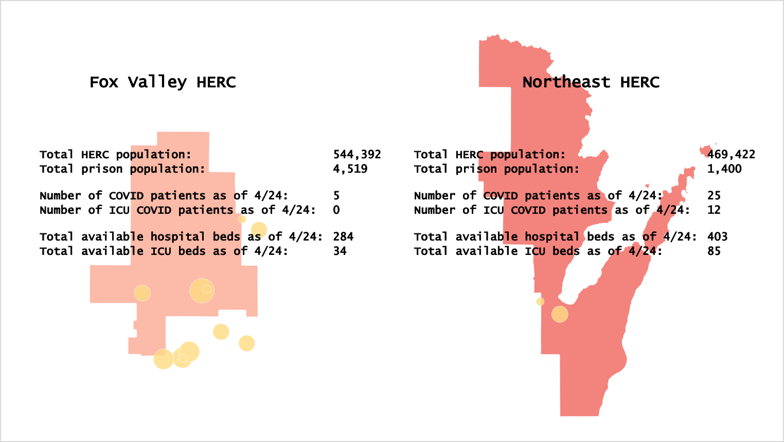
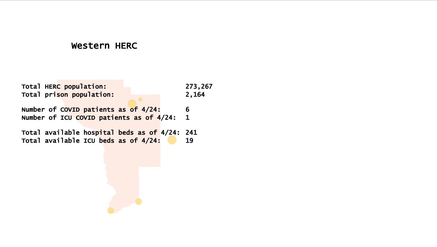
Fortunately, since we started our mapping efforts, the Wisconsin Hospital Association released a new tool with daily updates on bed counts and number of COVID-19 cases, so we could pull that information daily and compare it to what we knew about correctional populations. That daily information is provided at the healthcare emergency readiness coalition region (HERC) level. HERCs are regions within which certain healthcare and emergency response services are coordinated.
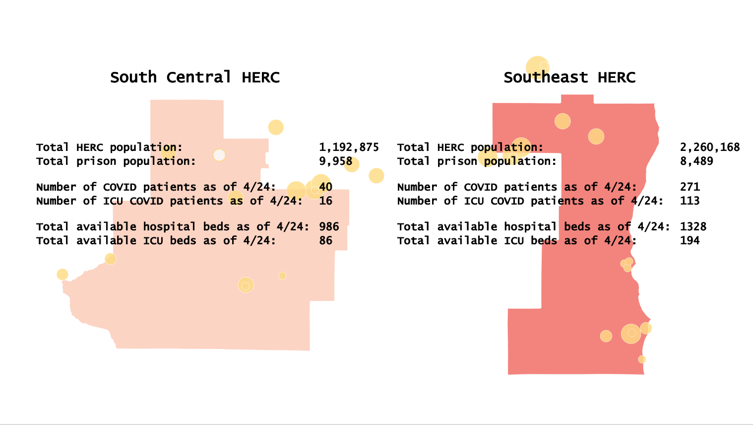
So with this information, we were able to look into HERCs that have large correctional populations and get a sense of where, if there was an outbreak, we would really be in trouble because of the scarcity of hospital resources (in particular, available ICU beds). So we went HERC by HERC and reported a few key indicators: the total population, the total correctional population, real hospital and ICU bed availability, and real numbers of COVID-19 cases and ICU COVID-19 cases.

Take for example, Fox Valley, in the central/eastern part in the state. That area has over half a million people, and 4500 people in its correctional population. As of the day we gave the ACLU zoom presentation, there were just 34 available ICU beds in the entire HERC. So, we did the following back-of-the envelope calculation: if even just half of the Fox Valley correctional population was infected in an outbreak, and assuming 10% of that group would need to be put on a ventilator (an extremely conservative estimate according to average hospitalization trajectories), that would mean we would need 225 beds. That’s a pretty fast-and-loose calculation because it assumes instantaneous infection, when in reality individuals would be infected over a series of weeks, and hospital beds would surely turn over as patients were released or died, but it nonetheless highlights the enormous mismatch because the vulnerable population and the number of likely available hospital resources, within the region in which individuals would be likely to receive treatment.
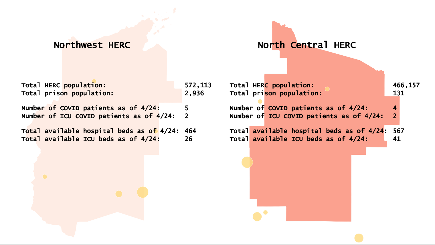
So the takeaway of this visual analysis was that (1) we should be really worried about these areas that have tons of prisons in the central/eastern part of the state, and (2) areas that we otherwise might not be so worried about because they are less populated, like the northernmost HERCS, actually could really be a problem. For example, Northwest HERC does not have a big population, relative to other parts of the state, but it does have a pretty sizable correctional population and very few ICU beds, so it could be hit especially hard if there was a prison outbreak.
Unfortunately, in the particular lawsuit that I mentioned at the beginning of this post, the Wisconsin Supreme Court declined to take the case (the petition asked the court to take original jurisdiction over the case, and thereby pass the lower courts). The court stated that is was “not persuaded that the relief requested, namely this court’s appointment of a special master to order and oversee the expedited reduction of a substantial population of Wisconsin’s correctional facilities is, in view of the myriad factual determinations this relief would entail, either within the scope of this court’s powers of mandamus or proper for an original action.” The Wisconsin ACLU has continued to advocate for the protection of its incarcerated populations in a number of other ways amid pandemic.
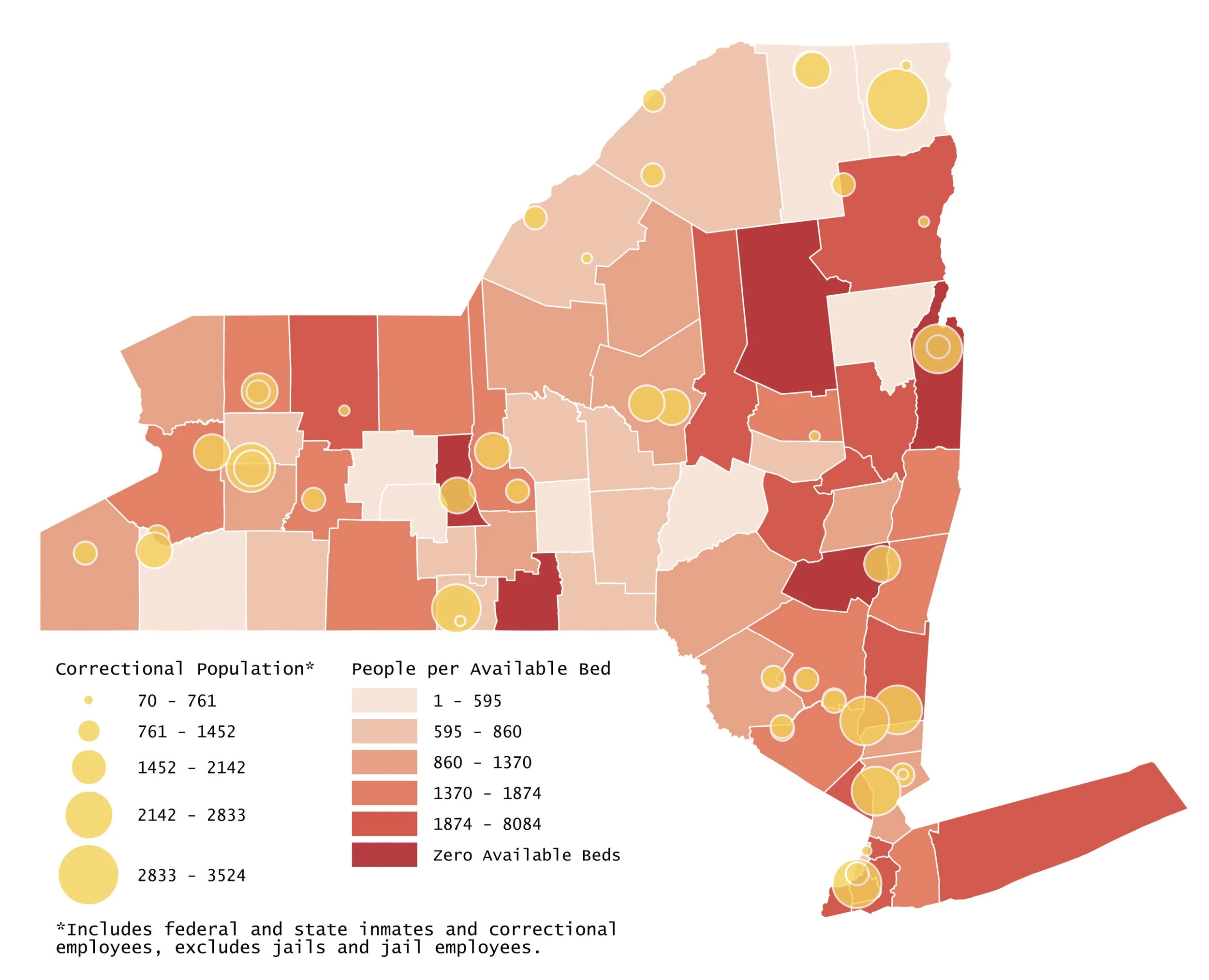
The team that I worked with on these Wisconsin projects has also been pursuing a similar COVID-19 mapping effort in New York. The map below (displaying the same phenomena that we initially mapped in Wisconsin) was prepared for leadership of the New York Department of Corrections and Community Supervision, as part of advocacy to the Governor to use his emergency powers to temporarily amend medical parole criteria to enable the release of certain inmates.