Cahill Calendar
I made a little 2015 calendar for myself in the Cahill projection.
I made a little 2015 calendar for myself in the Cahill projection.


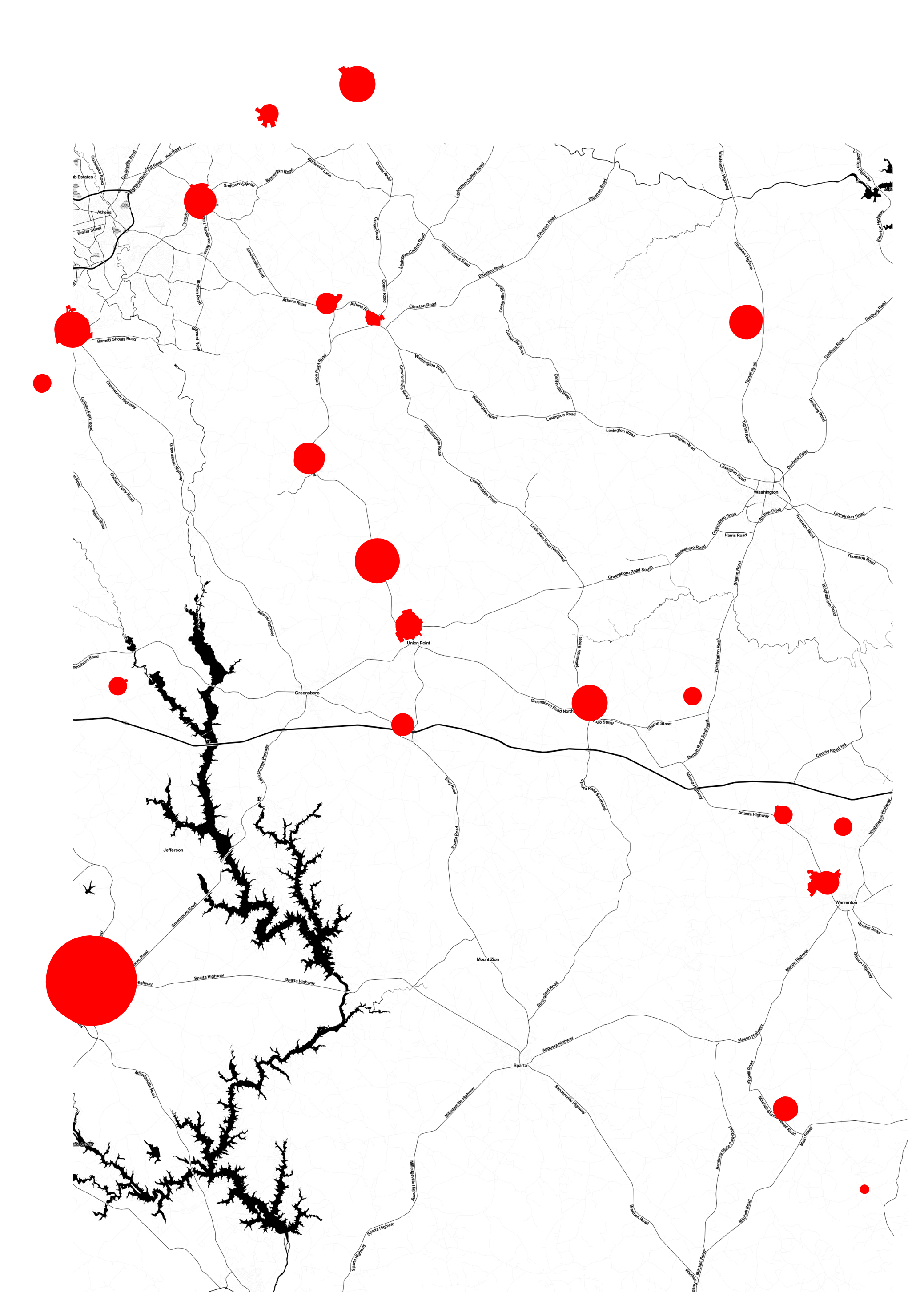
Those aren't candy or coffee stains. This post is dedicated to the shapely, circular cities of Georgia.
I extracted the circles from a shapefile of all Georgia cities (places), from Census TIGER/Line. You can download a csv of my list of circle cities, and join them with their shapefiles via GEOID.
I tried to do some research into why Georgia - and some of South Carolina - have this bizarre pattern, and there is very little out there. Big Think seems to be the only place where someone else thinks this is weird.
There are plenty of reasons why we don't expect administrative boundaries to take on such perfect geometry. Boundaries are usually drawn according to terrain or specific geographic features, or to delineate ethnic and cultural enclaves. Both of these things are rarely so oviform. In fact, there are political scientists who have devoted their work to studying the relationship between administrative boundary geometry and political outcomes. For example, Rutherford, Harmon, and Werfel devised the "Good Fences" theory, postulating that there will be greater political peace among territories separated by significant geographic elements, like rivers and mountains.
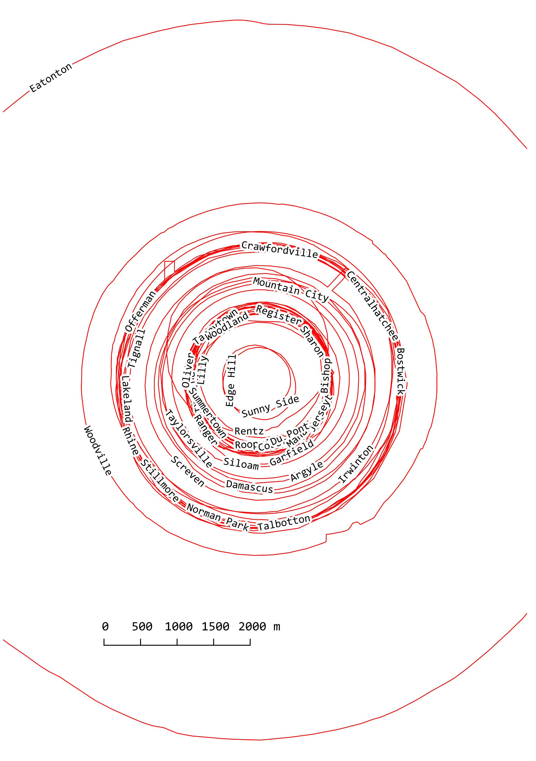
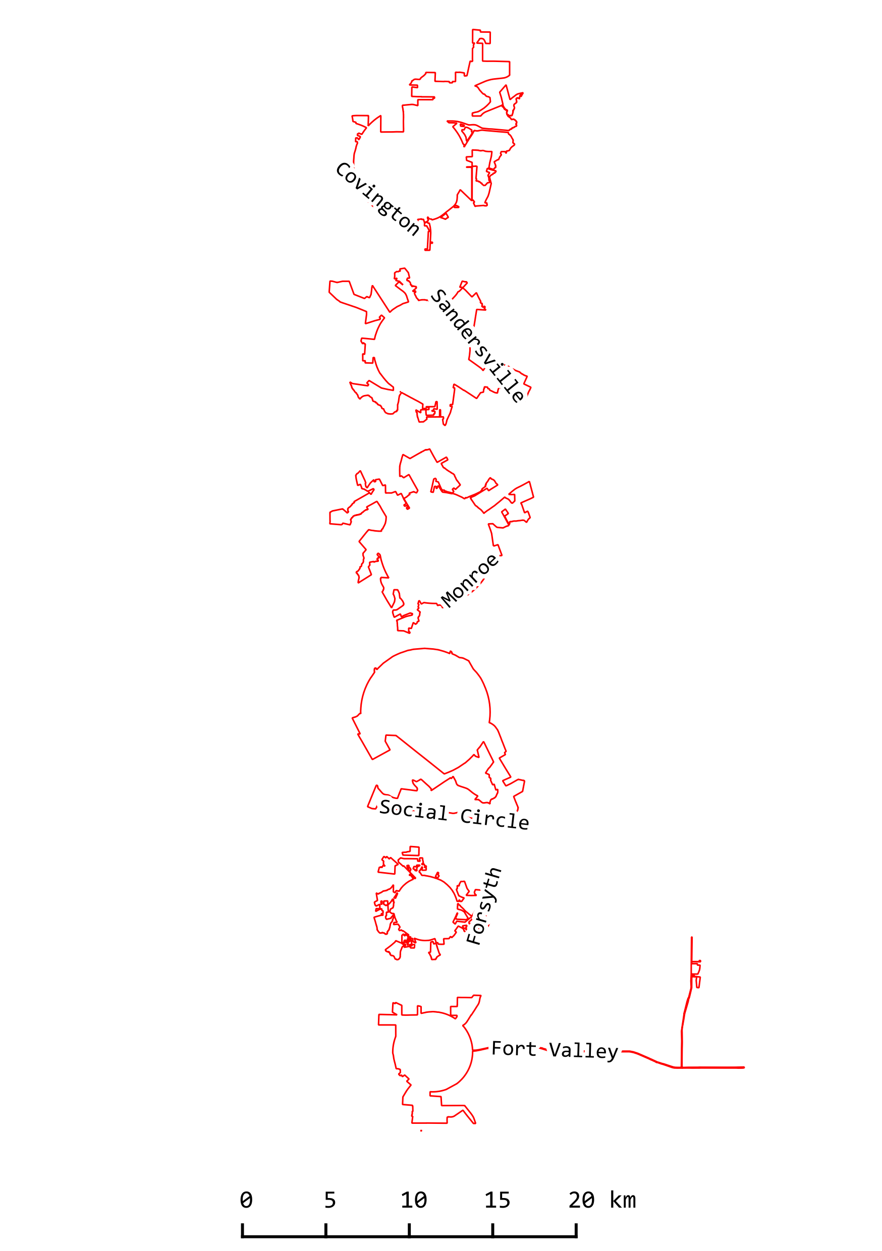
In Georgia, there are plenty of cities with nearly perfectly circular boundaries, see circle cities.1, and there are also city boundaries that apparently began as circles and expanded outward haphazardly, probably to incorporate specific desirable plots of land, and resulting in amazing cubist boundaries. See circle cities.2. In circle cities.1, where I layered the near perfectly circular cities above a common centroid, it's interesting that so many cities have the same diameter, most between 2500-3500 m. I'm picturing some omniscient god planner using the duplicate and move tools in his macro-planning toolkit to plop these cities across the country-side...
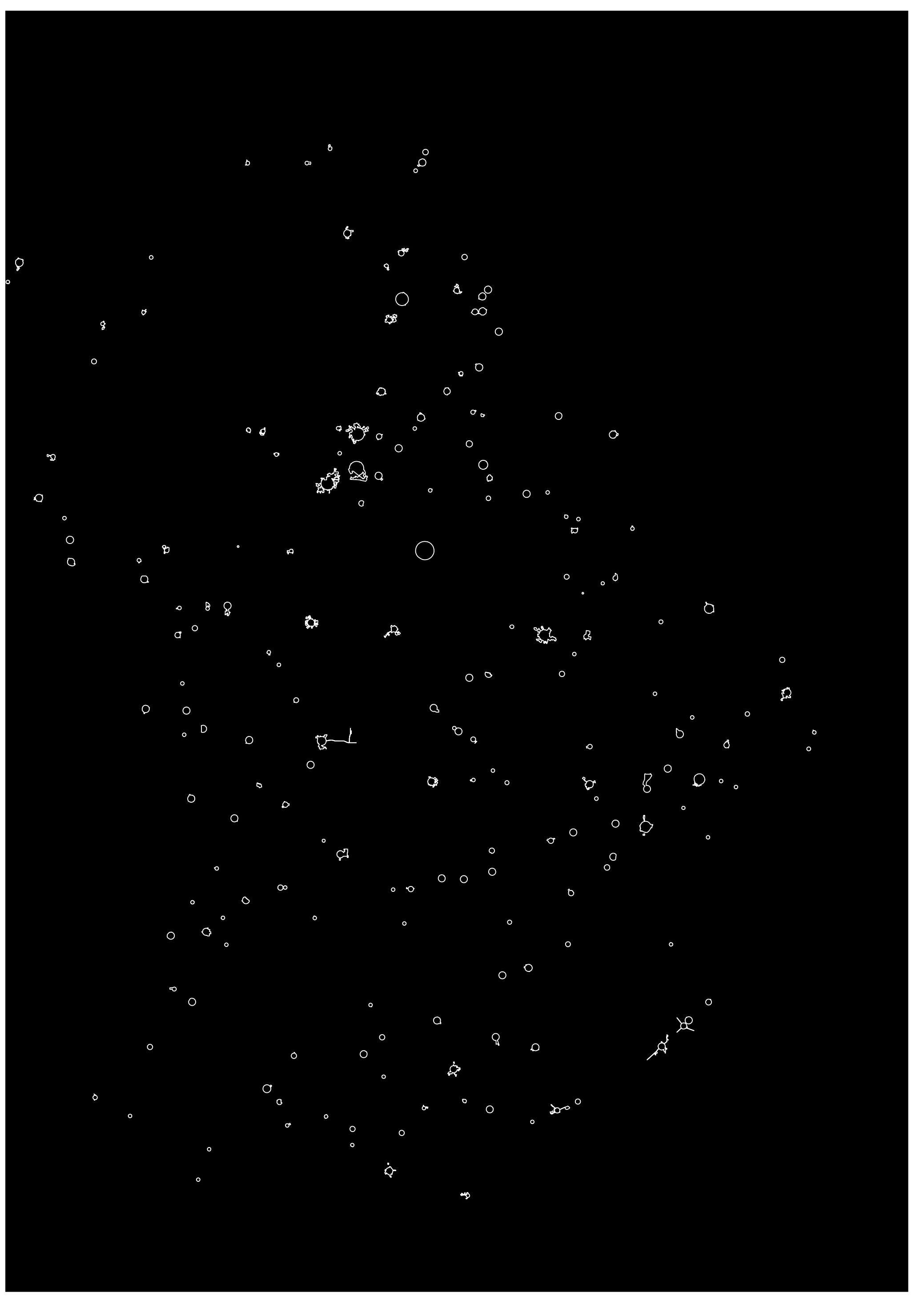
A few more images for your enjoyment: circle cities.3 shows just how many of circle towns there are in Georgia (in their true location). Circle cities.4 is the same map, but I was struck by how much these circles cities start to looks like constellations when you play with the colors.
All maps by Sarah. This post was inspired by designer Andy Proehl's maps of strange borders. Follow him.

circle cities.1

circle cities.2

circle cities.3

circle cities.4
I grabbed crimes from January 1, 2014 - Crime Incidents - Current Year - as a json and wrote a python script to use K-Means clustering to clean up and analyze the points. The clustering sorts the points around a centroid, so that every point is closer to that centroid than to any other. Crudely, it delineates clusters of points grouped around "hotspots." The map displays the generated centroids along with Police Districts and Neighborhoods.
Most reports in the city present crimes grouped by some other category: neighborhoods (orange) or police districts (green). Reporting crimes by natural groups of incidents reveals slightly more nuanced patterns.
For example, two of the crime "hotspots" that fall within the Tenderloin police district teeter on the border of the Southern police district and SOMA neighborhood. While crime reporting isolates Southern and SOMA crime, those incidents contribute (over 50%) to a crime pattern originating from the Tenderloin district. Additionally, the fourth largest hotspot, in Bayview (10288), compared to the largest, Tenderloin (18509), falls within the second largest police district (Bayview), whereas Tenderloin police district is the smallest of all.
This is the first part of a larger series I'll be working on to evaluate the distribution of crime and police resources, as well as perceptions of crime and safety, in San Francisco.
INCIDENTS
ROBBERY, ARMED WITH A GUN: 47
ROBBERY ON THE STREET WITH A GUN: 45
AGGRAVATED ASSAULT WITH A GUN: 32
POSS OF FIREARM BY CONVICTED FELON/ADDICT/ALIEN: 31
POSS OF LOADED FIREARM: 31
CARRYING A CONCEALED WEAPON: 21
ATTEMPTED HOMICIDE WITH A GUN: 5
ATTEMPTED ROBBERY COMM. ESTABLISHMENT WITH A GUN: 2
ATTEMPTED ROBBERY ON THE STREET WITH A GUN: 5
ATTEMPTED ROBBERY RESIDENCE WITH A GUN: 2
ATTEMPTED ROBBERY WITH A GUN: 7
ATTEMPTED SUICIDE BY FIREARMS: 1
CARJACKING WITH A GUN: 4
CARRYING OF CONCEALED WEAPON BY CONVICTED FELON: 6
MAYHEM WITH A GUN: 1
ROBBERY OF A BANK WITH A GUN: 7
ROBBERY OF A CHAIN STORE WITH A GUN: 2
ROBBERY OF A COMMERCIAL ESTABLISHMENT WITH A GUN: 5
ROBBERY OF A RESIDENCE WITH A GUN: 3
ROBBERY OF A SERVICE STATION WITH A GUN: 3
SUICIDE BY FIREARMS: 1
TAMPERING WITH MARKS ON FIREARM: 1
TURNED IN GUN: 10
DAY OF WEEK STATS
Friday: 55
Sunday: 46
Wednesday: 40
Tuesday: 40
Thursday: 34
Saturday: 30
Monday: 27
All of the gun-related crime in San Francisco over the past three months, mapped. Scroll over incidents for incident numbers, dates, descriptions, and resolution. Data extracted from Open Data SF, Map: Crime Incidents - Previous Three Months. Created with MapBox and TileMill.
Want to help efforts to get guns off the streets of San Francisco? Consider donating to Gunbygun - a San Francisco non-profit that crowdfunds for buyback events. They removed $20,000 of firearms from San Francisco streets last summer alone.
Like Gunbygun on Facebook.
Learn more about them.
Donate $50 to take a gun off the street.
Parcel heights & assessments NYC, from MapLUTO with TileMill. See fullscreen.
Density of residential units in NYC: Number of ResUnits per Lot. Data from MapPLUTO. Made with Mapbox Tiles. Hover over Manhattan lots for more info.
I just moved from New York City to San Francisco.
Celebrating the usual way, with some San Francisco development maps (all buildings in the city displayed by height).
From SF Open Data.
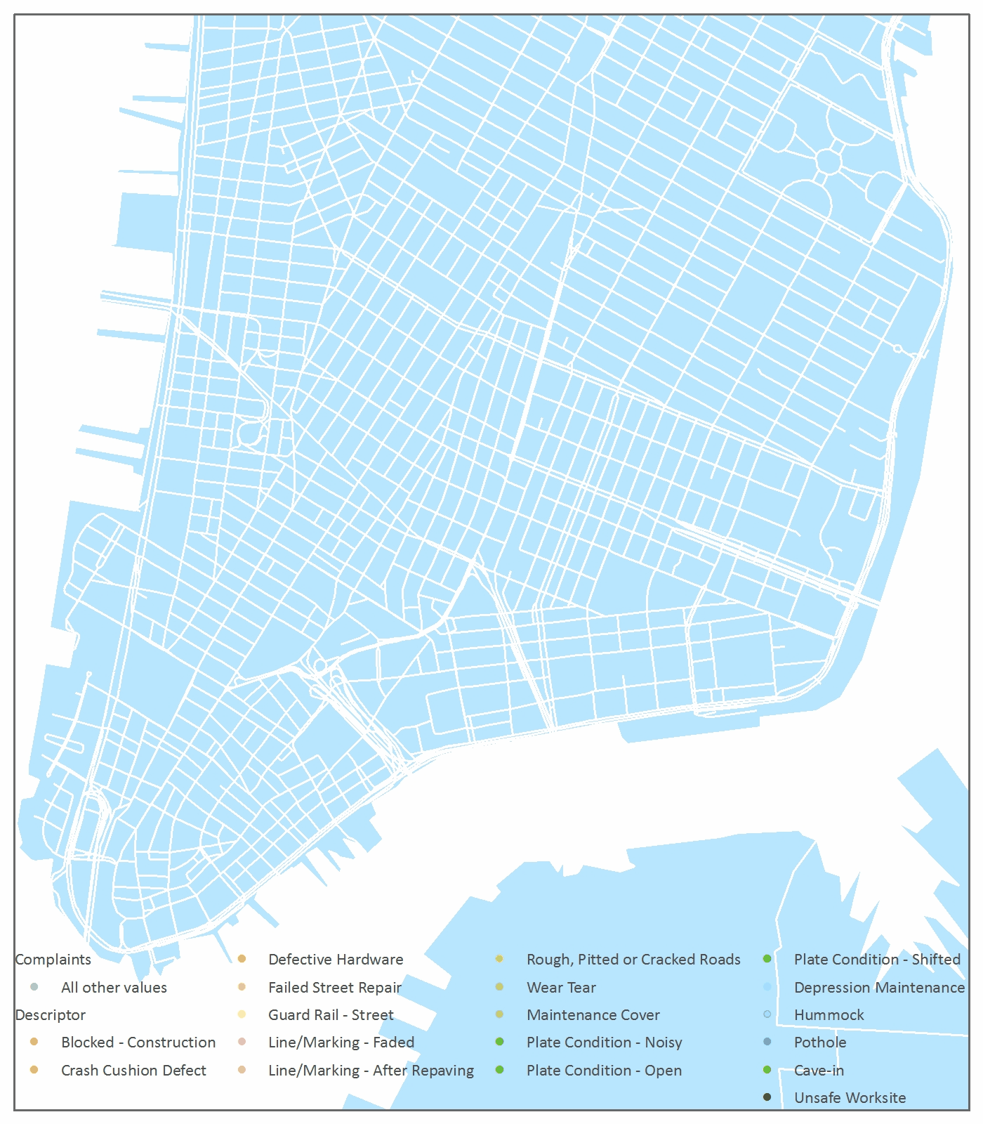
NYC DOT collects 311 complaints about roads. I animated the damage done over 2012 to visualize the beating that Manhattan streets take. It's no surprise that potholes are the biggest complaint, with practically one or more on every block. There is a scary number of "unsafe worksite" and "cave-in" (gah!?) reports.
This was a good project to experiment with the relative advantages of using a time slider to export to a movie versus building a GIF. The time slider works well but is fickle, and I find the enable time feature to be limiting. Some other features aren't as adaptable as I'd like them to be - for example, displaying the legend and identifying the best time increments. On the other hand, building the GIF is tedious. My computer is so slow with video that making GIFs was somehow faster.
What I had really hoped to do with this data was to visualize complaints as they happen throughout the year, and then have the points disappear as the complaints are addressed. This might give insight into which complaints and neighborhoods get the most and least attention. It became clear as I built the animation this way that the DOT system for reporting a complaint as "closed" is pretty arbitrary. The "closed" dates for each report were always close in time to some cluster of complaints, and stretched precisely a month apart, looking suspiciously like any given pile of complaints that might have accumulated on a desk over a month were all closed out before some analyst deadline.
All Upper Manhattan reported street complaints in 2012 every 19 days. All Lower Manhattan reported street complaints in 2012 every 19 days. Data from NYC Open Data 2012 311 complaints to the Department of Transportation.

I made a little map of the places I have lived.
I got shapefiles of Hoboken and Jersey City streets from Hudson County, Manhattan streets from NYC Open Data, and San Francisco streets from their Open Data portal.
I used three dataframes, which is a pretty terrible and hacky way to approach this. The three layers and frames were all zoomed to different scales to line up the cities, so formatting the lines to make it look uniform was a challenge.
I manually parsed a bunch of streets, making the density of the grids consistent in each city, and connecting major thoroughfares between between them. 6th Avenue became Palisade Avenue pretty seamlessly. Merging south San Francisco's streets was not quite so elegant, but I blame San Francisco streets.
If anyone knows a smarter way to join lines to this effect, let me know.
Inspired by You Are Here: Personal Geographies and Other Maps of the Imagination by Katharine Harmon.
All maps are fictional and sentimental, this one just a little more.